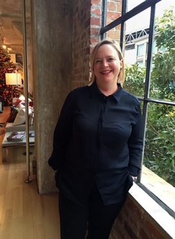
Melissa Mizell is a principal at Gensler, where she has worked on high-profile projects such as the Terminal 2 redesign at San Francisco International Airport. After graduation from Pratt Institute in Brooklyn, she honed her design sensibilities at Knoll International in Tokyo.
In addition to her award-winning work, Mizell finds time to teach courses in the Certificate Program in Interior Design and Interior Architecture at UC Berkeley Extension. She recently talked with us about her career, trends in design and what she does to replenish her creativity.
Is there one project that stands out in your career, either because of its impact or because it simply is your favorite?
I would say the most transformational one for me was working at San Francisco International Airport because it's a blend of all the things I learned from all my other projects. For many people, the airport is a workplace—not just the people who work there, but also those who travel for business and need to be productive while they're there. It's a place of hospitality, commerce, retail and concessions. Also, I’m interested in sustainability, and the airport needed to be a high-performance building and a healthy place. There are so many aspects of what Gensler does and what I had been doing at Gensler that suddenly were important for this project.
If I'm not teaching a design class at Extension, I'm usually taking a class.
Did you set out to make T2 at SFO the first LEED Gold terminal, or was that a result of decisions made during the design/build process?
The city required us to be LEED-certified. But, we stopped thinking about this LEED goal and thought about it from a sustainability perspective. What is our point of view? And this is how every project should be. LEED is great, but it's just a way of measuring what you've done. The design strategy of having a particular sustainability point of view is much more useful. So we came up with this idea of performance and delight: For all of our sustainability or energy or water-saving strategies, they needed to tie into other things such as passenger comfort or passenger delight. And that made those strategies bullet-proof. It was the first project where I could really explore all those things and put them into action. What happened with the Gold surprised us. Now, it's the new standard.
What are some of the trends you see in interior design and architecture?
The idea of thinking about the user experience first and designing through that lens. The visual qualities that are so important—like proportion and form and light—are still critical and come into play as you design. But if you're designing through the lens of someone who's experiencing it, I think you end up with a better product. It also helps shield you from thoughts like, “Oh, this is pretty," or trends that may be really seductive at the moment but shouldn't last.
How do you replenish your imagination?
I serially take painting classes at UC Berkeley Extension. If I'm not teaching a design class at Extension, I'm usually taking a class. I love watching the way that the instructors have the ability to teach students of all ages—some people are in their 80s and some are fresh out of high school. I love that they can work with anybody along their own personal journey in art: someone who's just beginning and someone like me, who has been painting for a while. They can work with and inspire us both. It's such a positive atmosphere. I also learn a lot from them. When they talk about the formalities of the visual arts, I realize that so many of those things apply back to design, the biggest ideas being light and dark. I think being able to explore your own area of interest, but through a different lens, is a useful tool.


